Identity
Built a flexible system: logo, posters, merch, motion and digital assets.
Built a flexible system: logo, posters, merch, motion and digital assets.

Turned the portfolio into a calm interactive journey through spaces and details.

Shot a series of visuals where the product becomes part of the urban scene.

Created an online space with interactive halls, audio and archive materials.
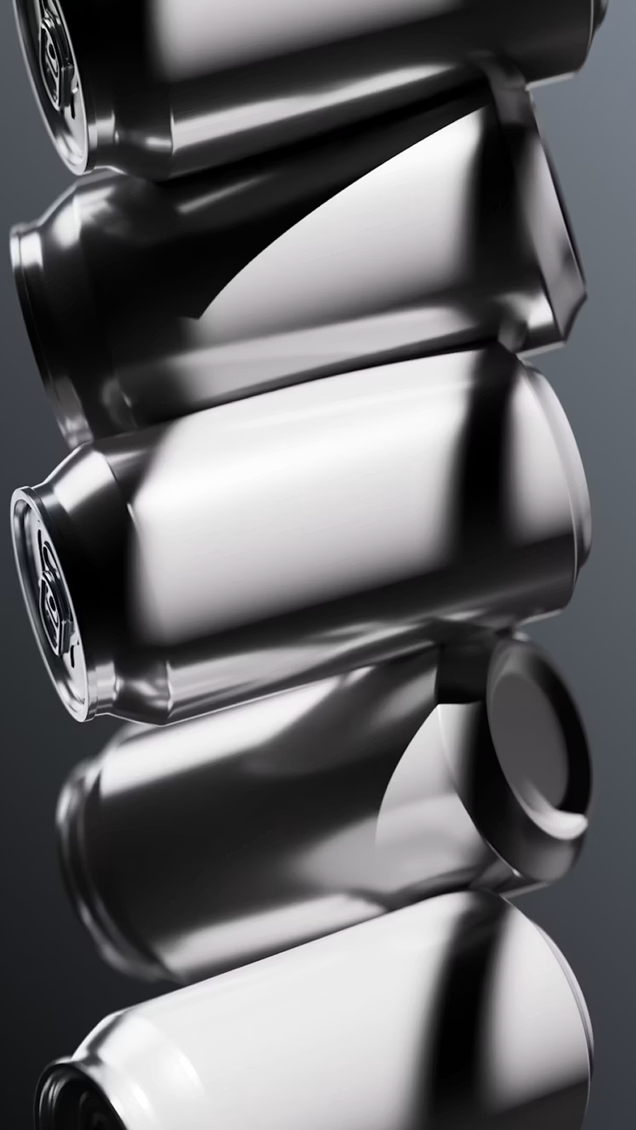
Updated grid, typography and reading flow for long-form visual stories.
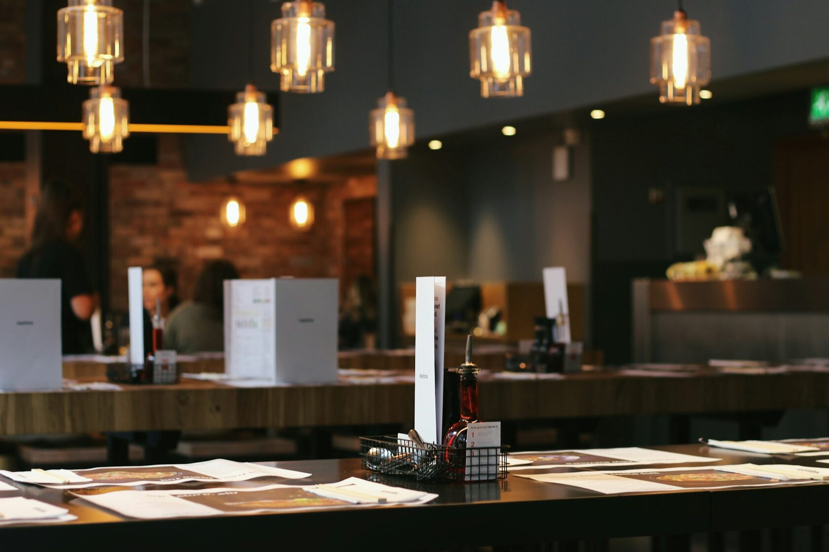
Designed the visual language for a seasonal menu and the printed tableware.
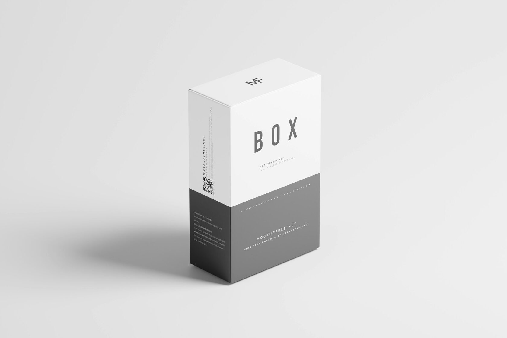
Built a modular packaging system that ships in three sizes and four colourways.
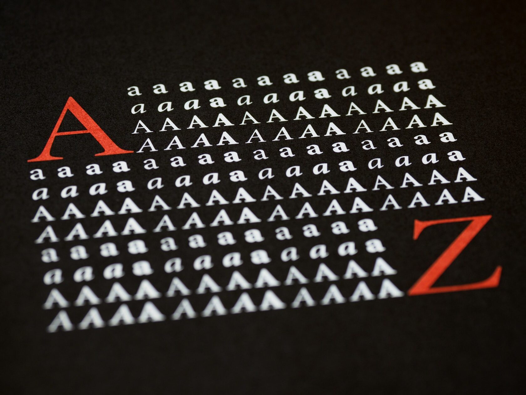
Drawn a full type family for a public festival of independent publishing.
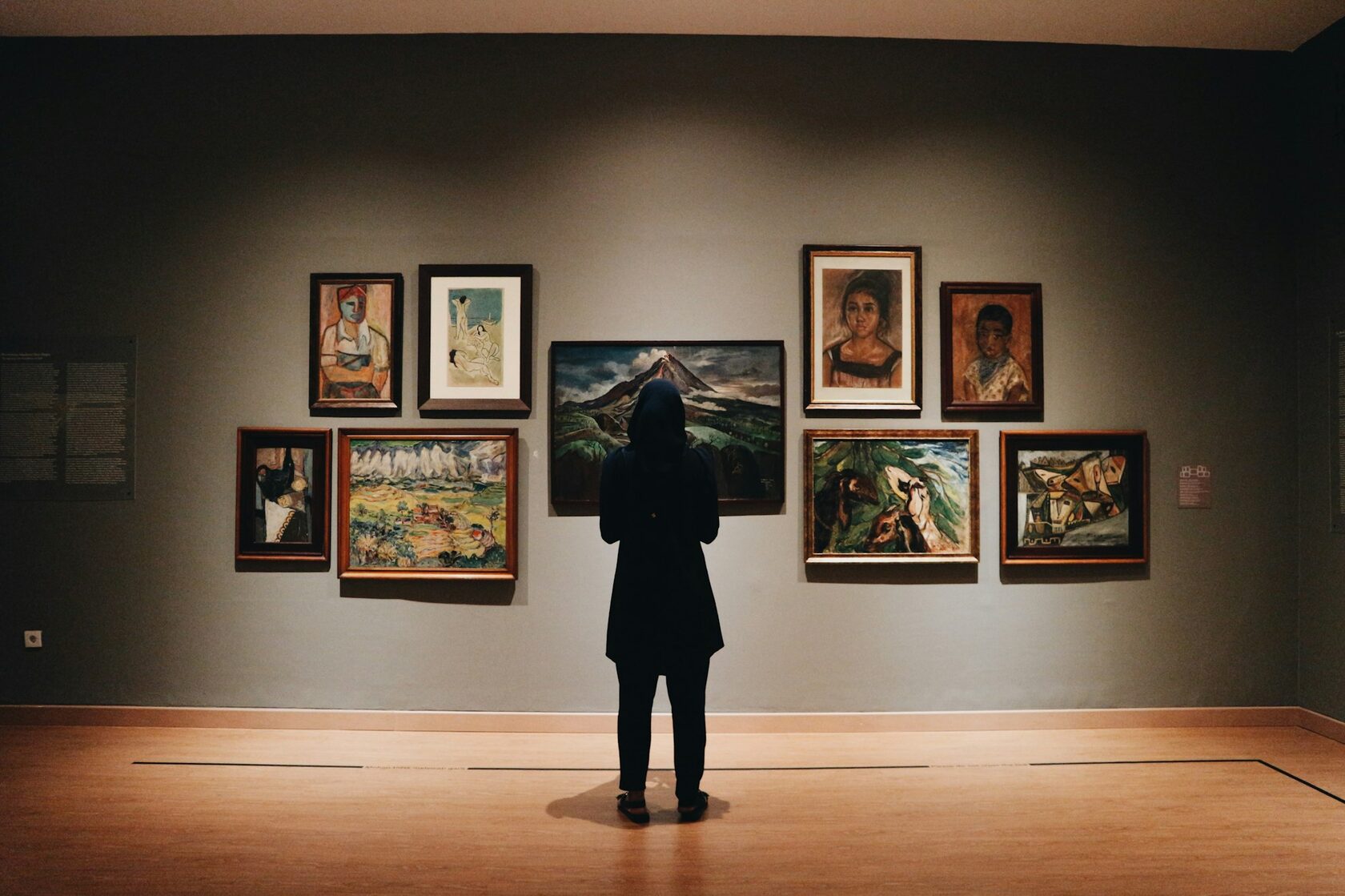
Coded the catalogue as a quiet scrolling essay with full-bleed image plates.
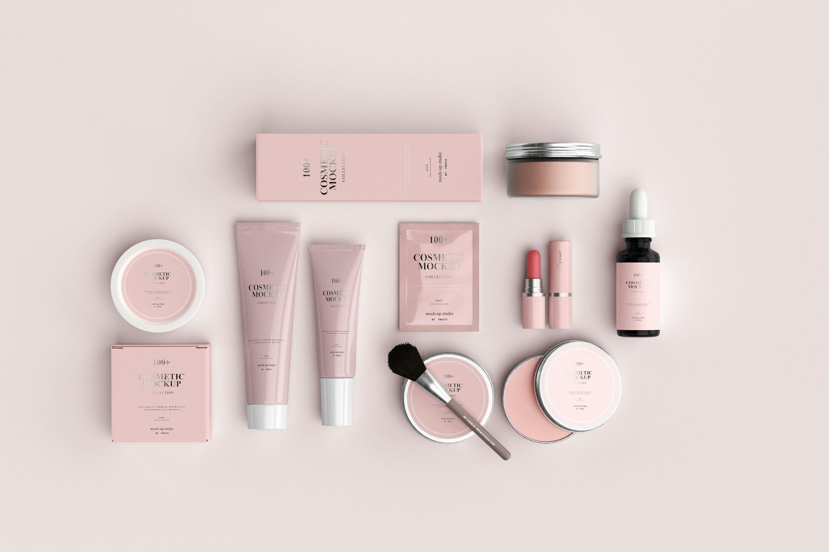
Built the naming, the bottle geometry and the soft retail signage together.
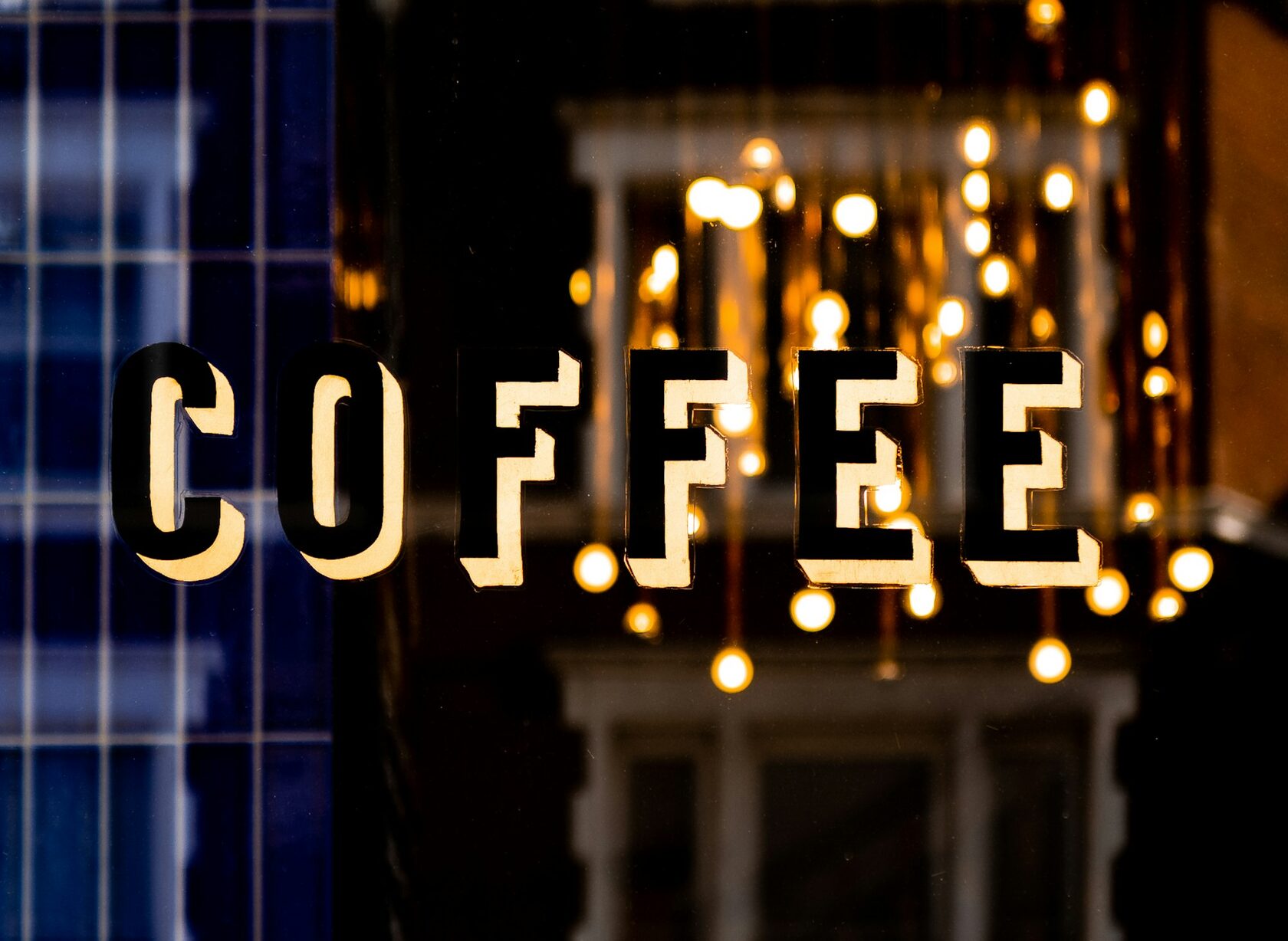
Painted the shopfront sign by hand and matched the cup print to the day's batch.
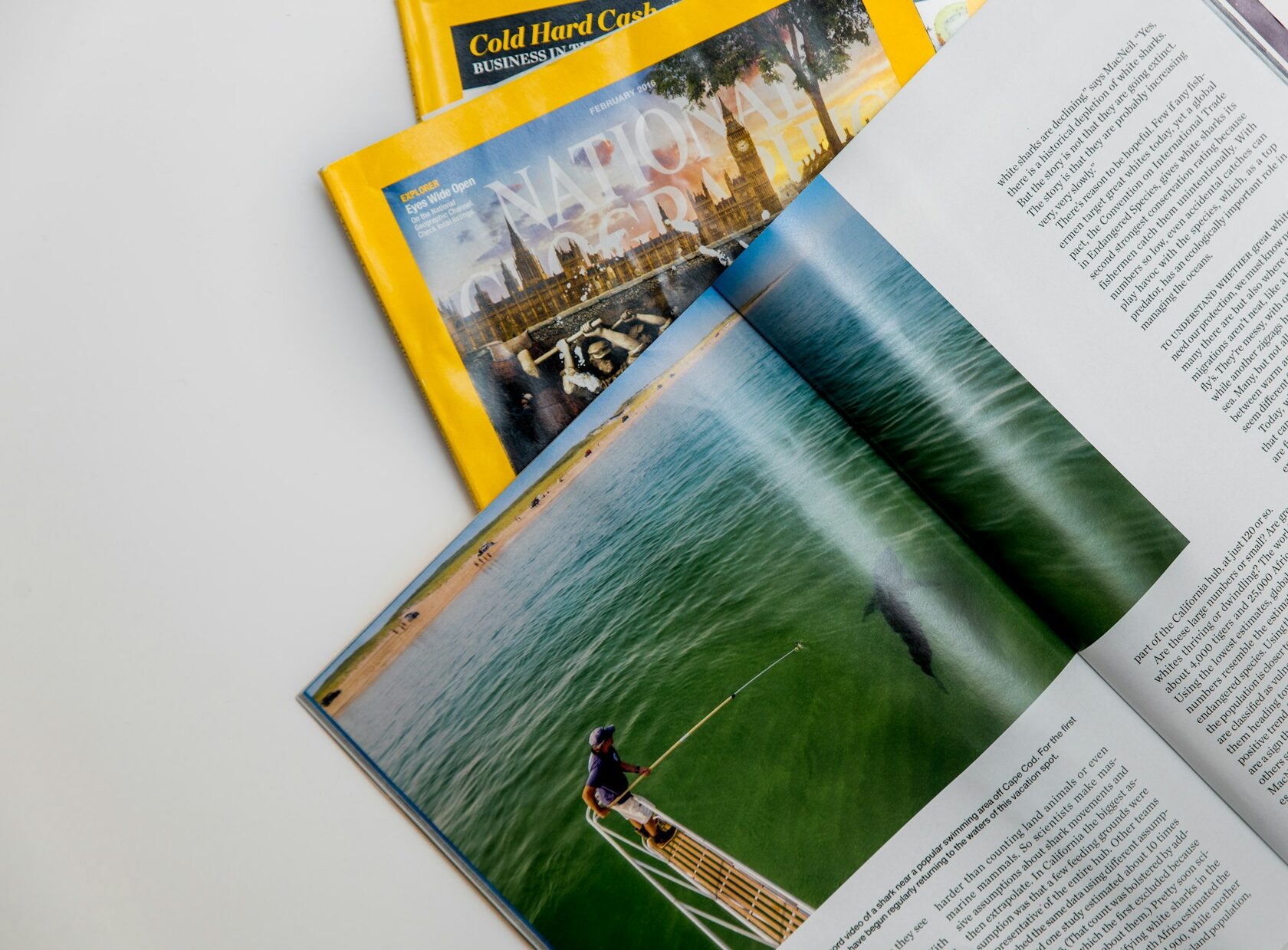
Reorganised the spread for a reader who carries the issue on a long flight.
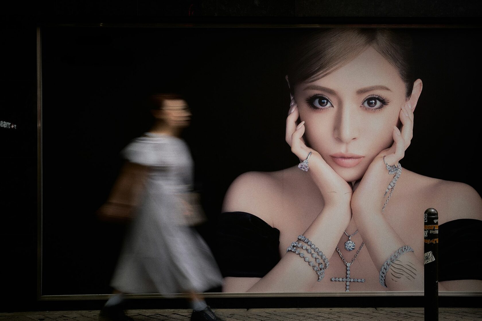
Cast the jewellery in low light and let the metal do most of the talking.
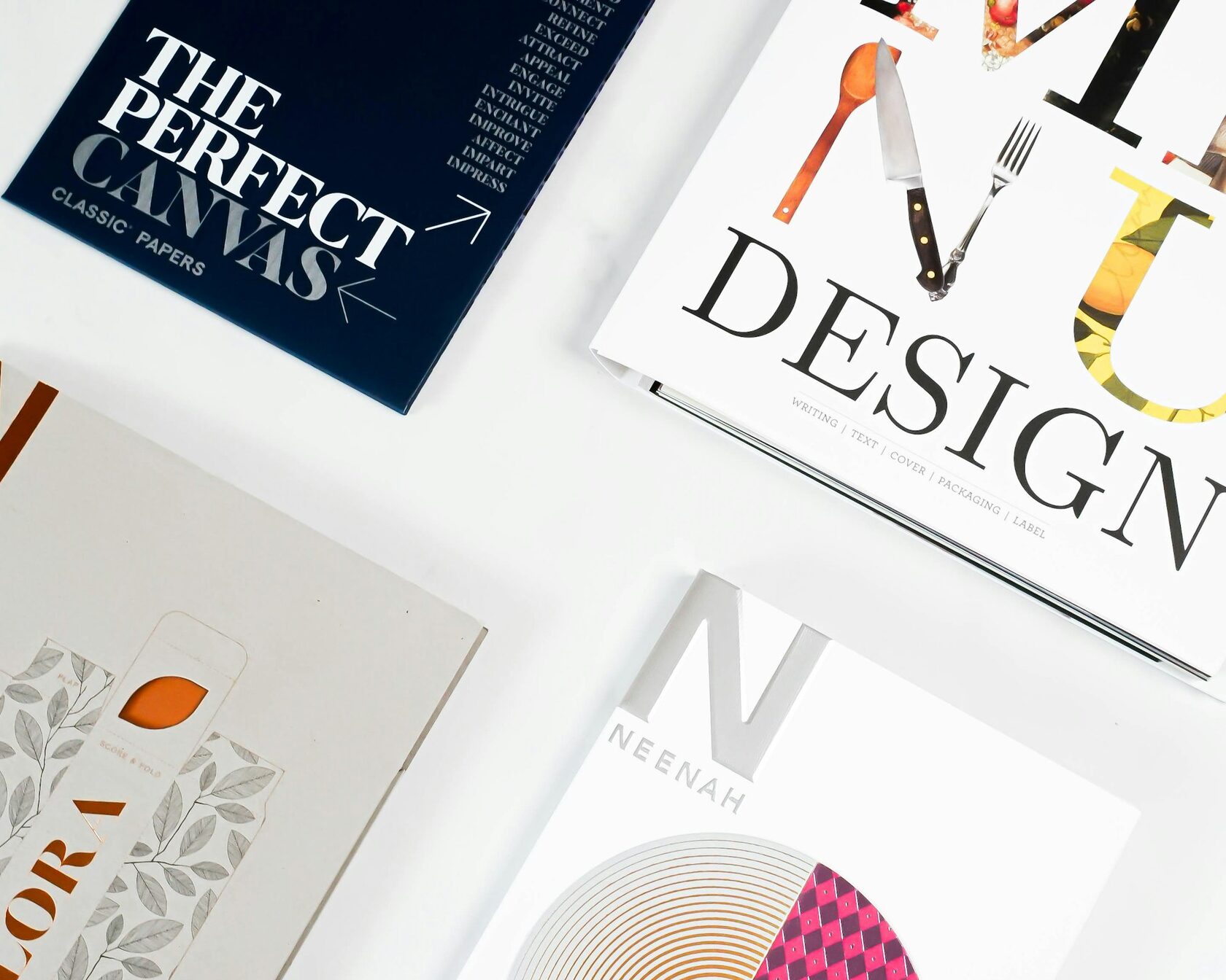
Composed the cover around a single oversized letter and a deep paper texture.
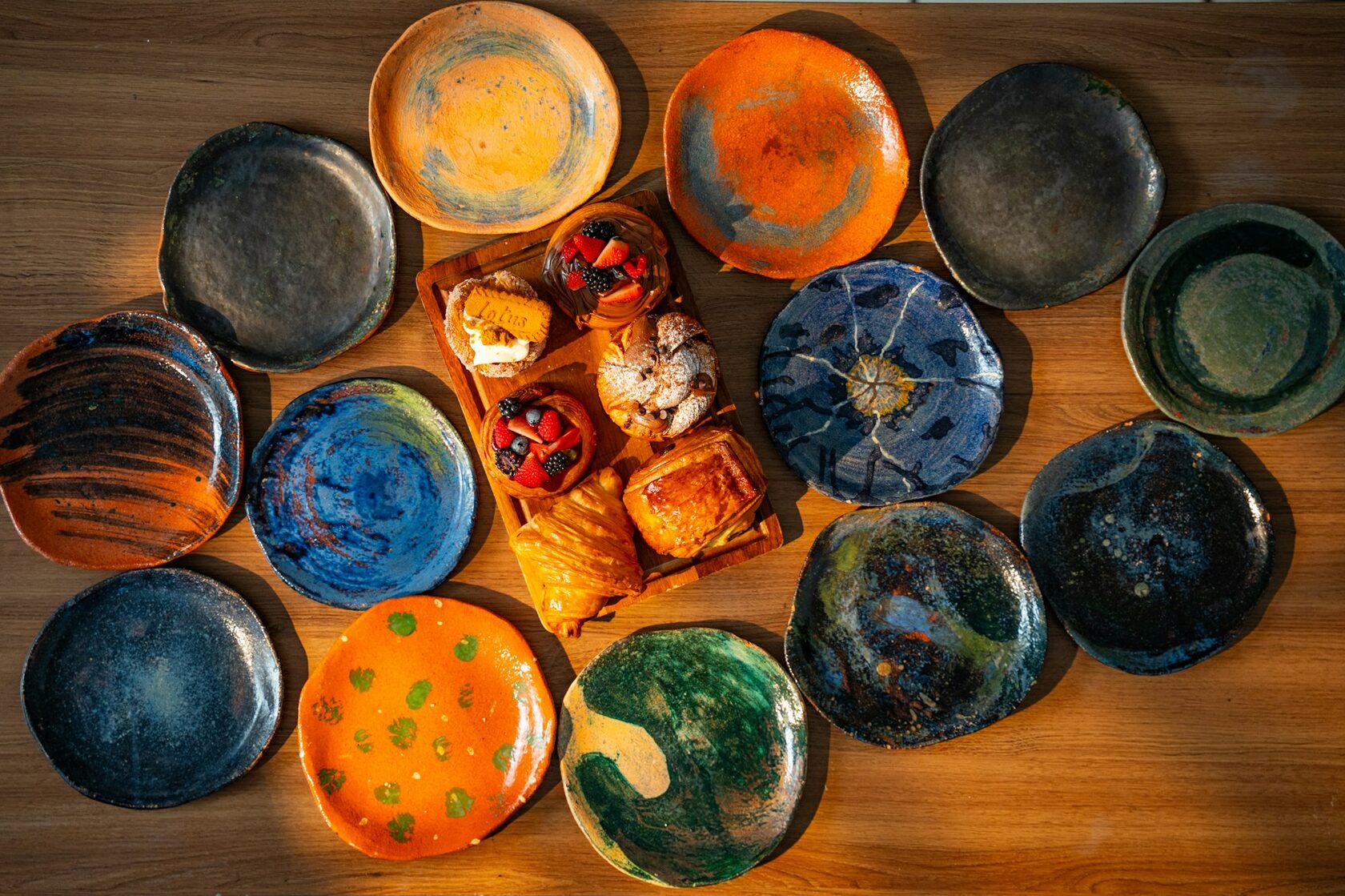
Photographed each piece at the same hour of afternoon for a steady colour read.
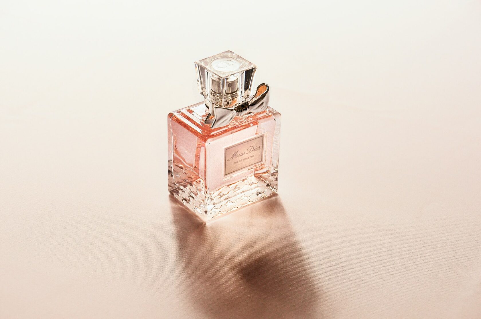
Lit the bottle with one soft source and let the cap reflect the surrounding room.
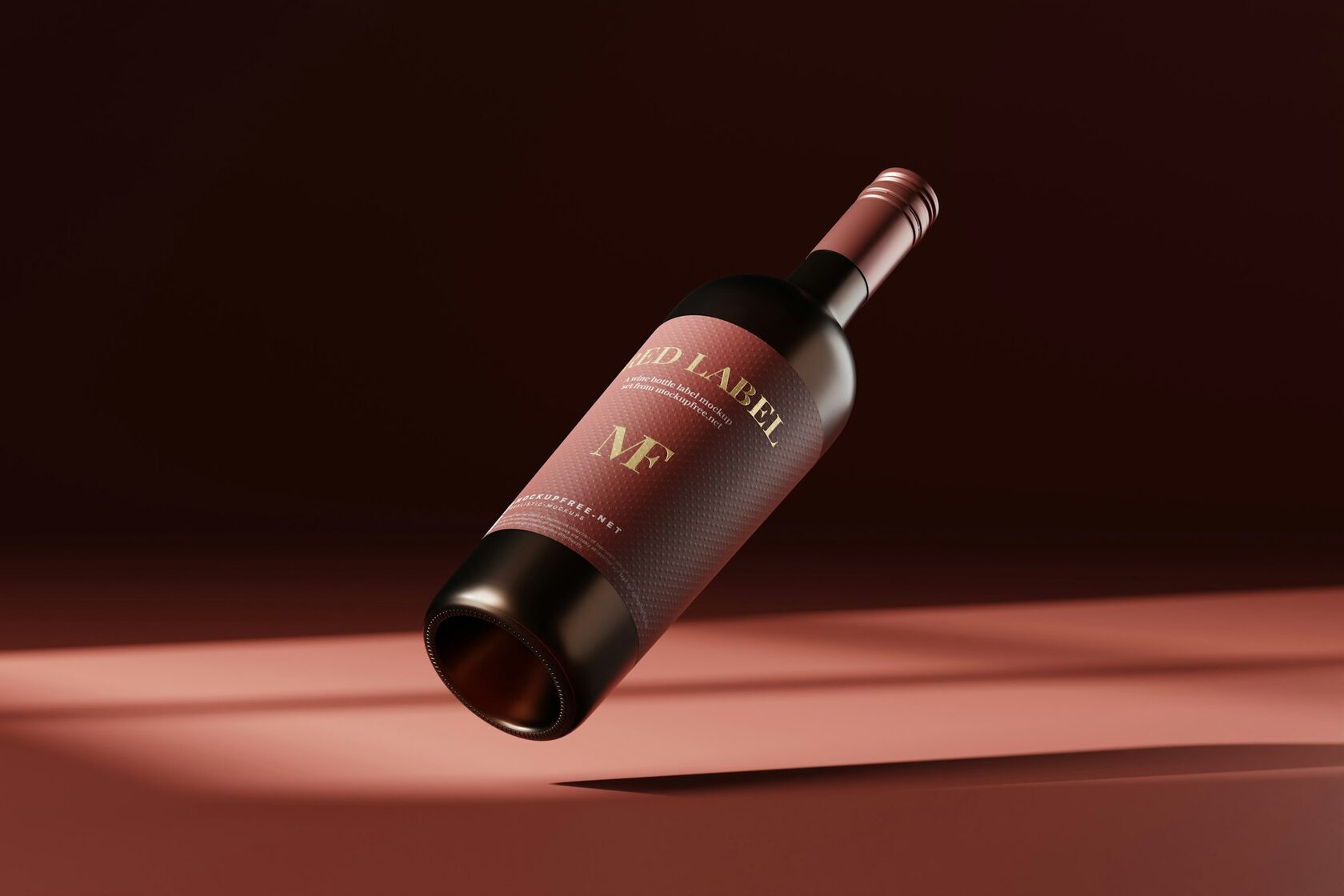
Drew the label as a small still life and printed it on uncoated cotton stock.
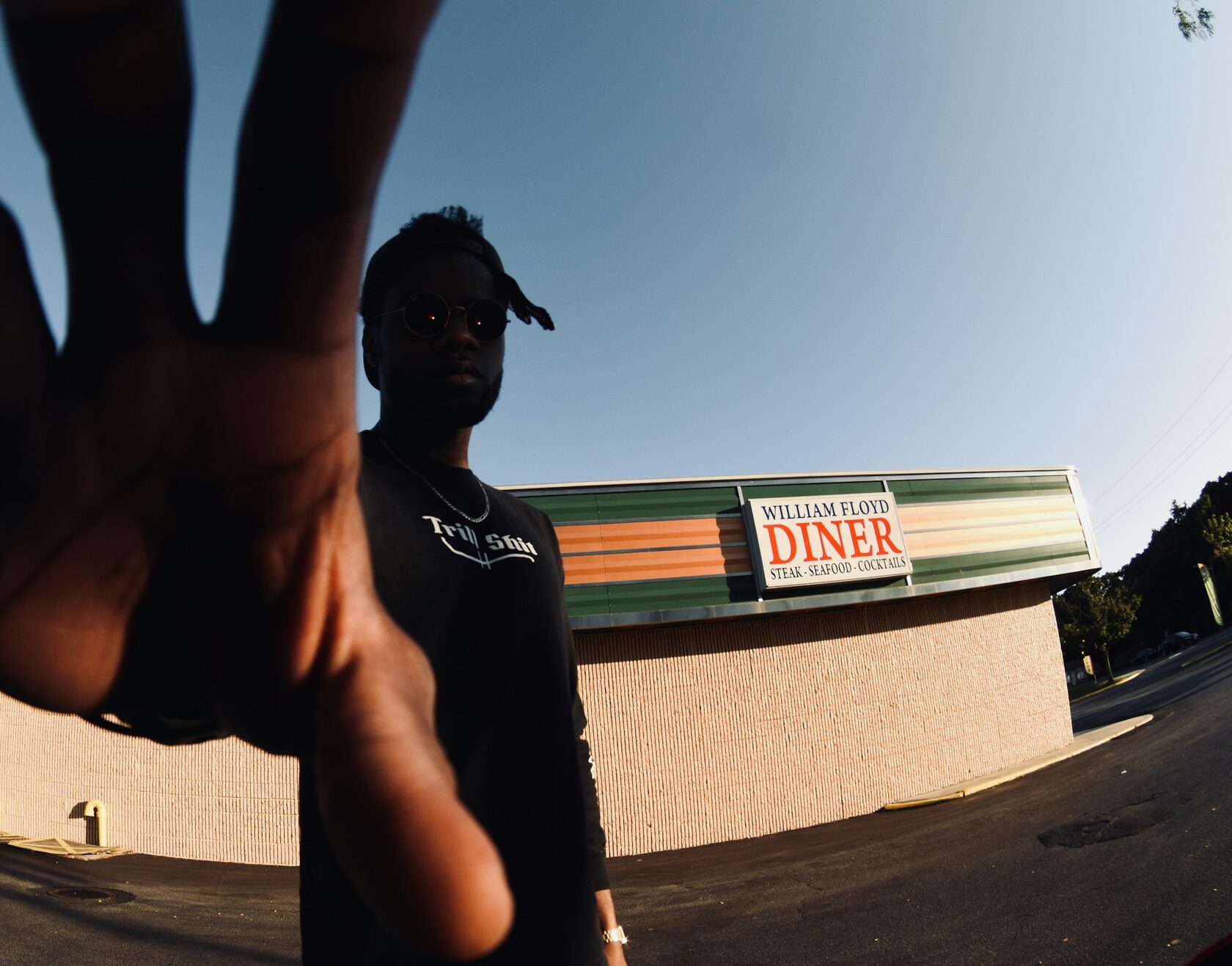
Shot the campaign at street level and let the city's noise bleed into the frame.
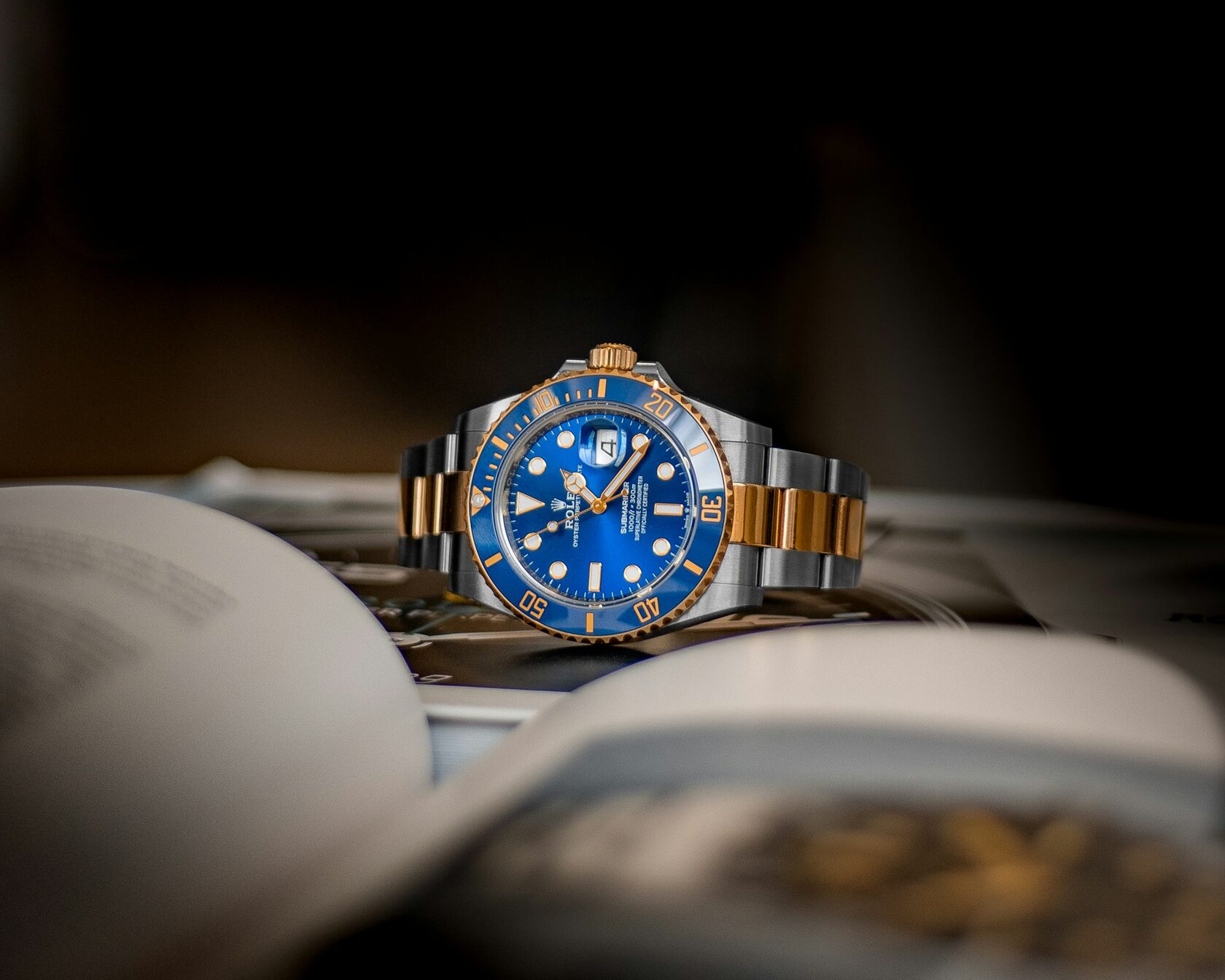
Built a macro rig for one shot per dial, finished on a long quiet afternoon.
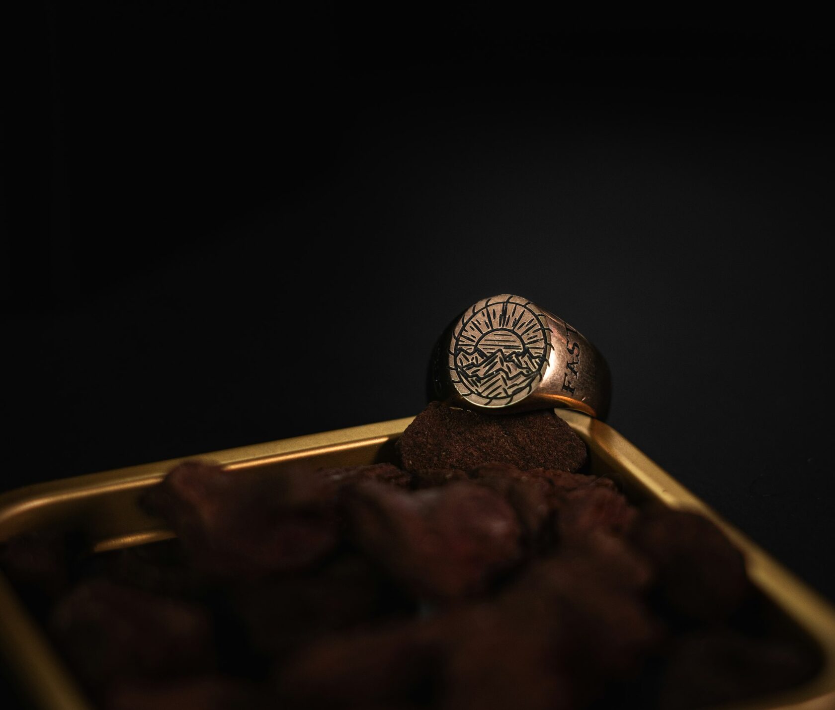
Foiled the wrapper in a single colour and let the bar shape carry the rest.
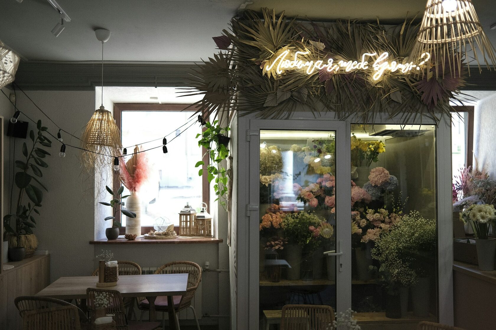
Picked the type from a 1920s seed catalogue and kept the kerning open.
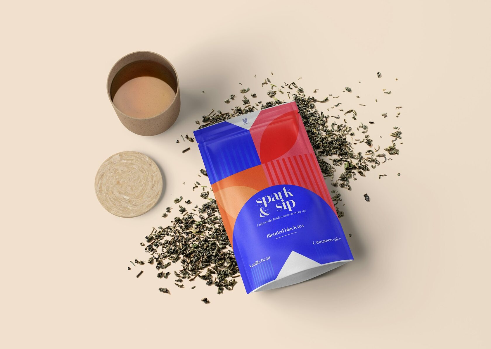
Set the tasting notes in serif and the brewing time in numerals, side by side.
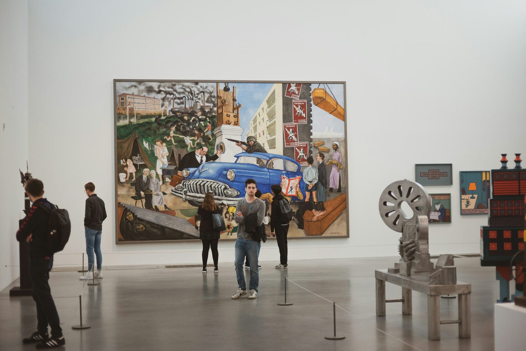
Designed the wayfinding for a museum that changes its shows every six weeks.
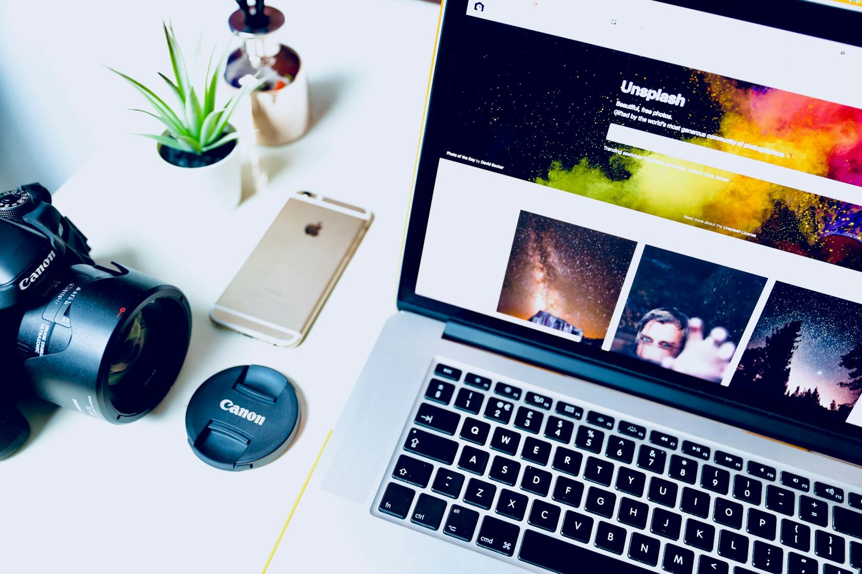
Built the portfolio so each series gets its own pace, font and frame ratio.
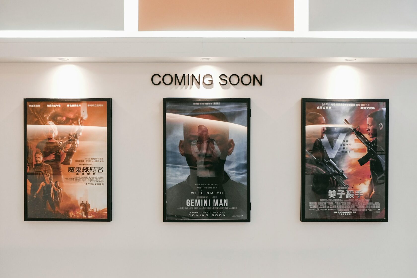
Drew a different poster for each day of the festival and kept the system visible.
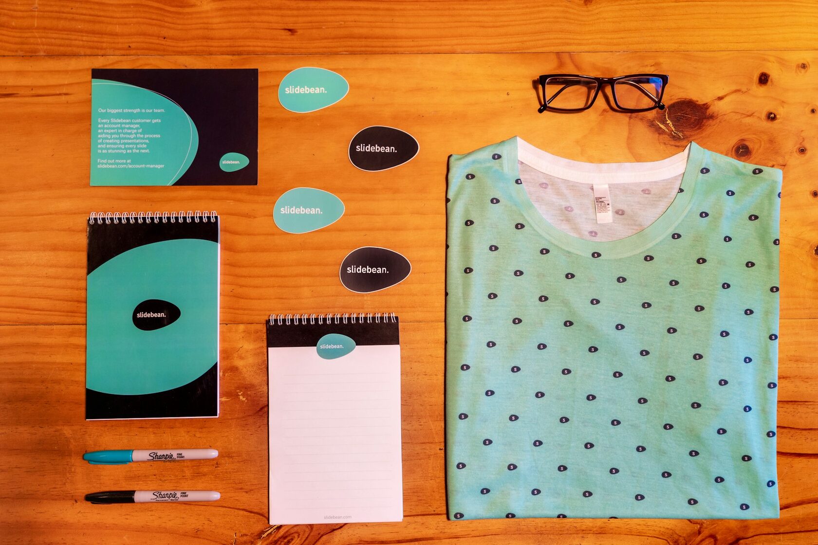
Lit the entrance sign in a colour that only reads at night, never by day.
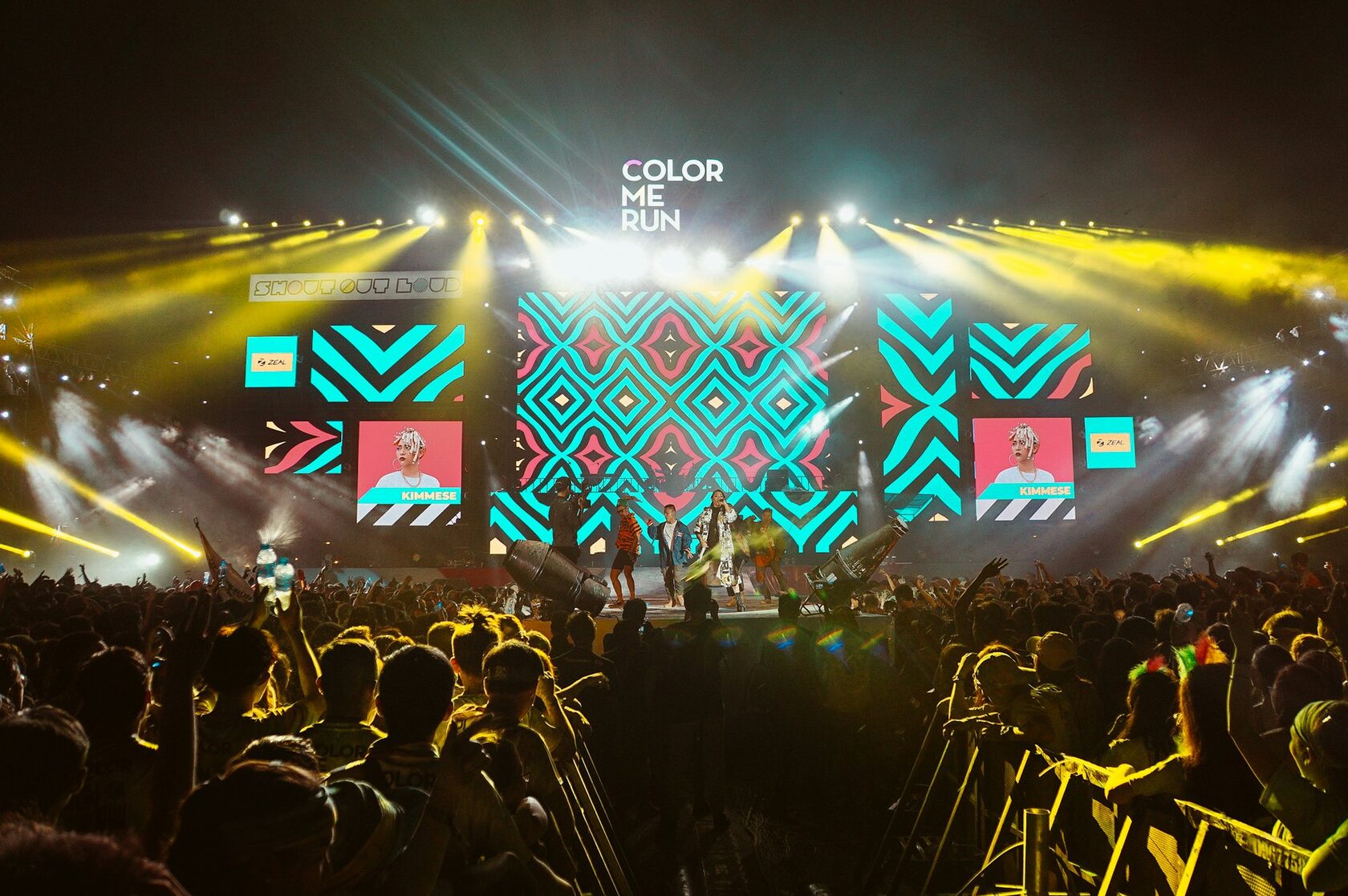
Wrapped the festival in a single signature shape and reused it everywhere.
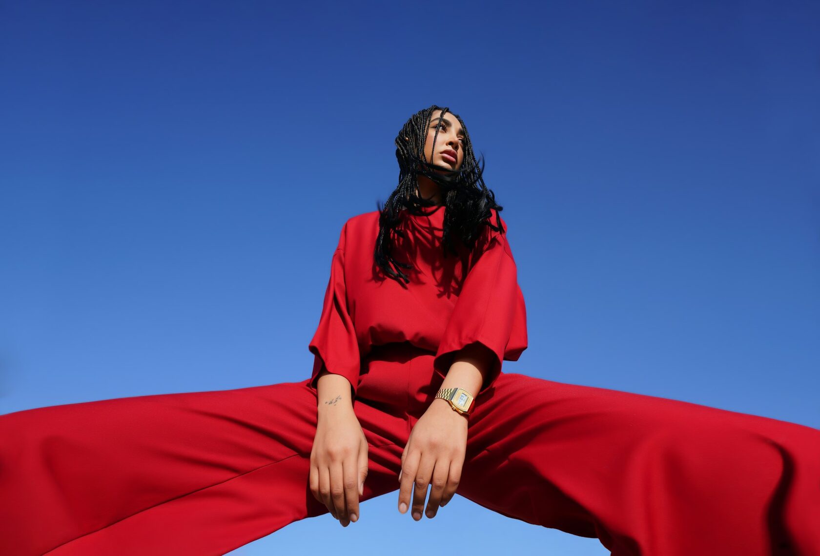
Sent the team out at dawn to catch the same street before the crowds arrive.
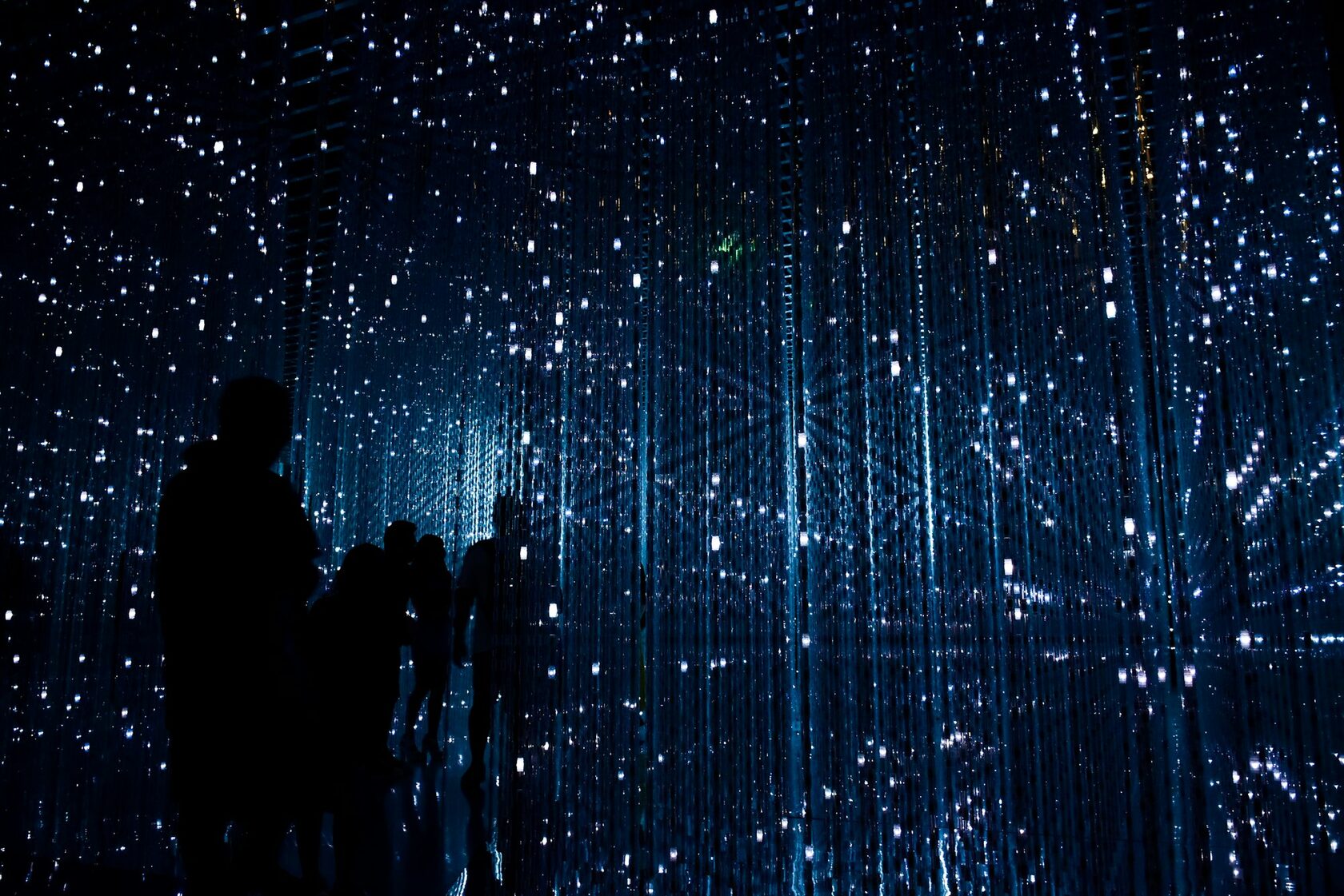
Built the audio guide to react to the visitor's pace and the room's acoustics.
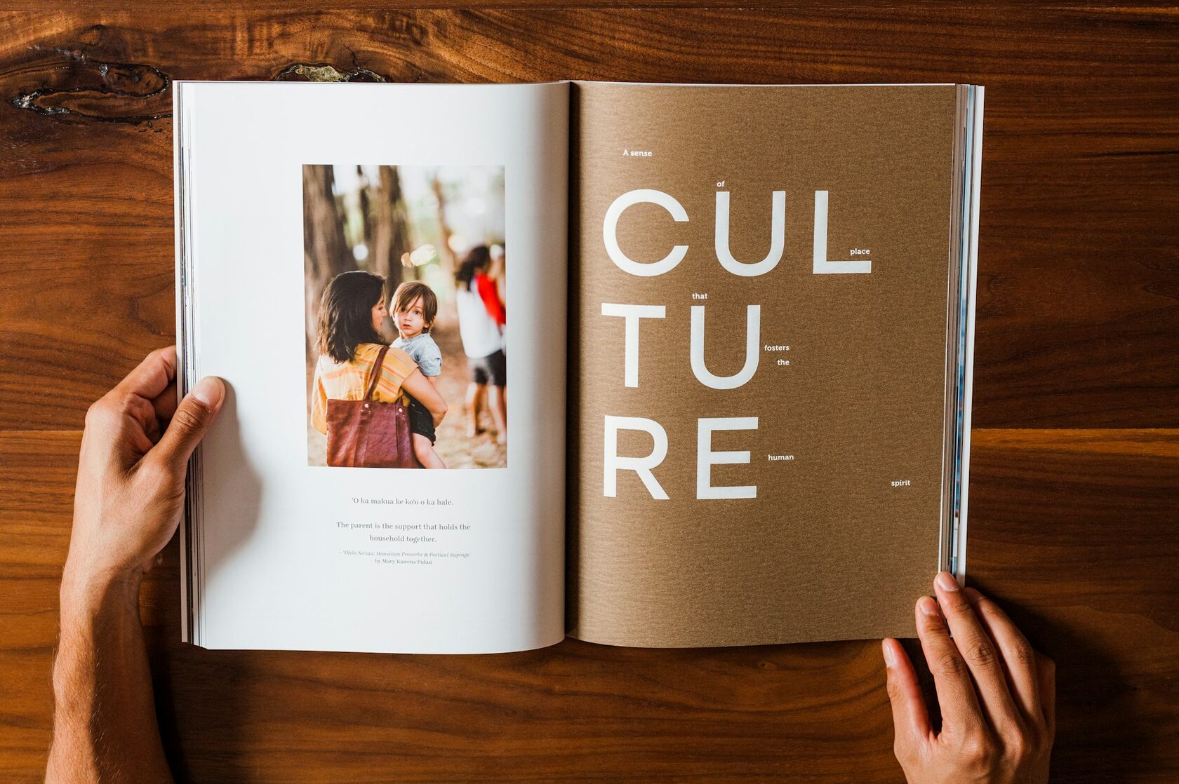
Reframed the homepage around three long reads and one quiet weekly note.